
In late 2019, we published our report to parliament on the 2018–19 results of health financial audits. Accompanying the report is our hospital and health service data visualisation tool.
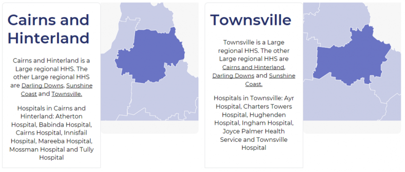
This cool visualisation tool allows you to better understand Queensland’s hospital and health services (HHSs) via an interactive map:
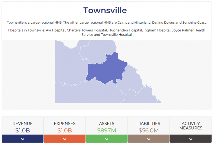
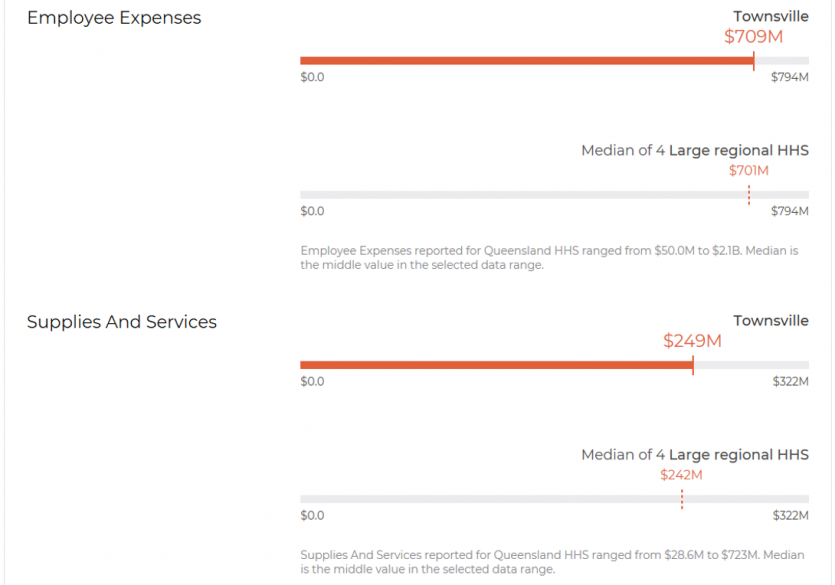
By clicking on the breakdown buttons, you can analyse financial information and non-financial information, such as what your HHS earns, where its revenues come from and what it spends its money on:
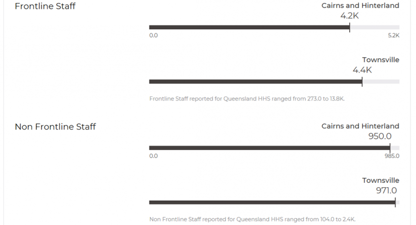
You can also compare and benchmark your HHS with another HHS in the state. For example, you can compare how many frontline and non-frontline staff your HHS has compared with another HHS:
Our visualisations also include a variety of financial metrics and ratios to help you understand the financial sustainability of your HHS compared to others.
But wait, there’s more! Be sure to also check out our other recent data visualisations too:
- As part of our Managing the sustainability of local government services report, we published a local government visualisation tool. It also includes a variety of financial information, such as the amount of grants income each local government has received and the sustainability metrics local governments are required to report on.
- Our full suite of dashboards is available on our Interactive dashboards webpage.
Over time, we are planning to integrate our data visualisations into one ‘umbrella’ map or product. This will be a great way to see financial and non-financial information of services you receive.
We love hearing from our stakeholders about the value they receive from our products. Please send any feedback on what could make our visualisations better to qao@qao.qld.gov.au.
Related article

Our changing reports and tools
As of this financial year, we are now presenting our reports digitally on our website. They are easily navigated and accessible.